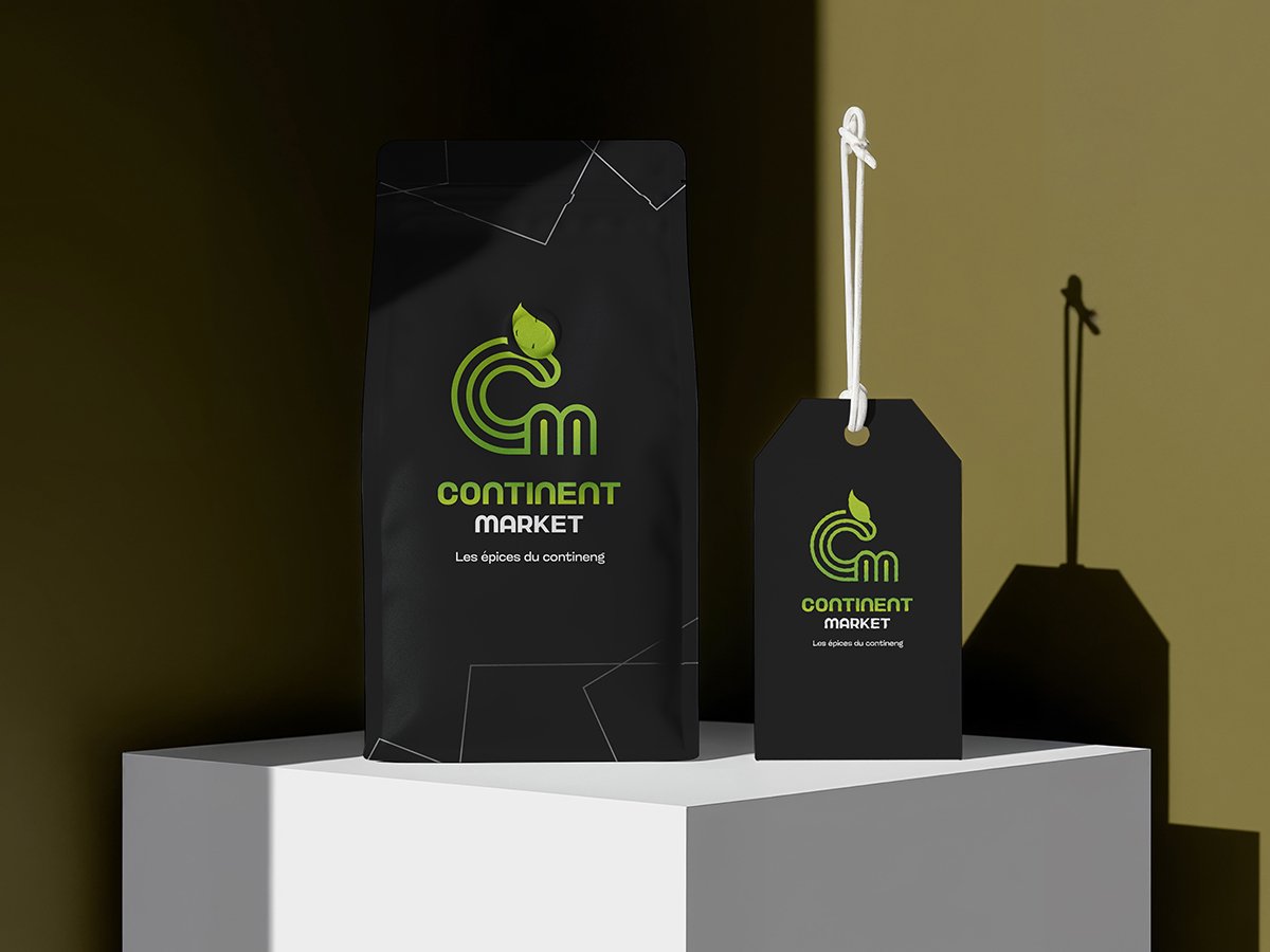
Continent Market
This wasn’t just about information – it was about forging a unified
company culture.
The Challenge
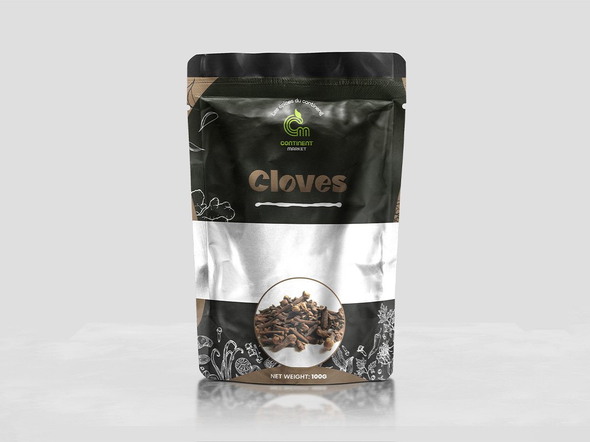
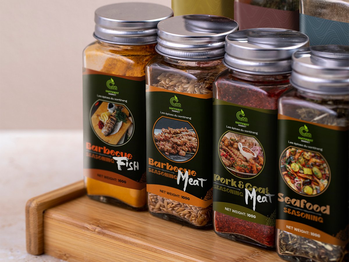
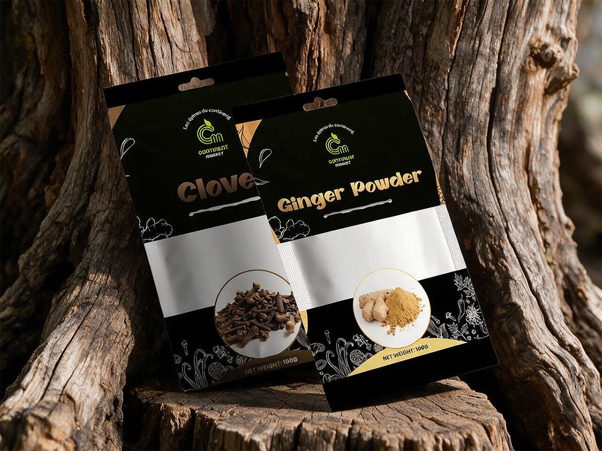
Continent Market needed a distinctive brand identity and packaging system for its growing range of spices and seasonings. The main challenge was to create packaging that looked premium, communicated natural ingredients, stood out on retail shelves, and remained consistent across jars, pouches, and hanging packets.
Our Approach
We developed a modern visual identity inspired by nature, authenticity, and continental flavours. The design combines dark green, black, bright green, orange, gold, and silver to create a premium yet approachable appearance.
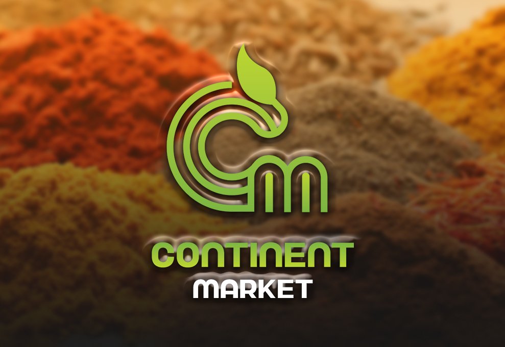
The logo features a stylized CM monogram with a leaf, representing freshness, natural ingredients, growth, and the brand’s connection to food and spices.
Product photography, ingredient images, botanical illustrations, bold typography, and structured layouts were used to make each product easy to recognize while maintaining a unified brand identity.
Key updates included:
The Outcome
The final design gave Continent Market a strong, professional, and recognizable presence. Each product now has its own identity while remaining clearly connected to the overall brand.
The packaging effectively communicates freshness, quality, authentic flavour, and premium positioning. The flexible system also allows the brand to introduce additional spices and seasonings without losing visual consistency.
What We Delivered
" As we continued to use their tool and found more use cases, our feature requests quickly found their way into their backlog. "

Cristian M. Durant
"Their team understood our goals immediately, and every iteration brought us closer to a refined, meaningful experience."

Cristian M. Durant
"From the initial concept to final delivery, the process was fluid and collaborative — we always felt heard."

Cristian M. Durant